top of page

MAN OR MOUSE
MAN OR MOUSE

Illustrator, AFTER AFFECTS and Graphic Design
BRAND:
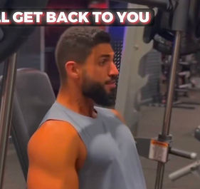
As a dedicated personal trainer, Mossab Ahmed prioritizes more than merely providing fitness instruction. He serves as a mentor, devoted to not only assisting his clients in reaching their goals but also guiding them towards a heightened awareness of long-term health and self-assurance.
Our mission is to craft a logo that ignites a fire within our audience, urging them to push beyond their comfort zones and reach for greatness. We want to inspire and motivate them to break free from the constraints of fear and doubt, and instead, embrace their inner strength and power.
BRIEF:
The project aims to design a new logo for the clients upcoming bootcamp service he aims to introduce to a male only audience. The bootcamp is conducted exclusively outdoors with the intention of fostering a sense of brotherhood among participants to promote long-term motivation towards individual health and self-improvement.

KEY WORDS: MASCULINE, BOLD, STRONG, PRINCIPLED, DARING


the first initial designs by the client on Canva to give an idea about the visual elements needed and the colour scheme. the overall idea is to have the man imposing over the mouse with a subtle versus visual.

Taking into consideration the client's vision, I drew inspiration from strongman poses and the client's head profile to craft a unique strongman stance. I opted for a minimalist silhouette design to highlight the muscles and masculine demeanor of the figure

For the ultimate design, I aimed to intertwine the concept of man and mouse, illustrating how both strength and weakness coexist within the human condition. This idea is inspired by the themes explored in John Steinbeck's novel "Of Mice and Men.
COLOUR PALETTE:
The fiery red hues in the logo ignite a powerful and commanding presence, exuding strength and vigor. It symbolizes a relentless energy and a fierce determination that cannot be ignored.
In stark contrast, the dull grey represents a sense of vulnerability, reminiscent of a meek and timid mouse. It embodies feelings of melancholy, apathy, and hopelessness, serving as a stark foil to the fiery red.
Lastly, the bold black serves as the glue that binds the opposing forces of strength and weakness together. It adds a touch of sophistication and elegance, creating a sleek and minimalistic appearance that exudes a sense of professionalism and seriousness.

bottom of page